Prezi Design Strategies
Ten years ago Dr. Kathleen Yancey taught English 459/659 Studio Composition and Communication at Clemson University. The class was unlike any I had ever taken, as it used experiential learning to help us all develop a language for describing multimodal texts and interactions created across the curriculum. We read, wrote responses, created several small exercises, completed four major projects, and submitted a final digital portfolio incorporating everything we did that semester. Those who successfully completed the class had the option to become consultants at the Class of 1941 Studio for Student Communication, which was to open the following semester.
Understandably, Yancey designed an intense syllabus with a wide range of readings and assignments that bridged written, verbal, visual, and digital forms of communication. I still remember how mind-bending and engaging those assignments were (and how difficult it was to write reflections on my assignments after they were completed), but there was one assignment in particular that really helped me see software in a new way.
As part of this assignment, we were first asked to create a handout illustrating a concept we were discussing in class. I chose the concept of “image” and used Shortcuts by Jeff Harris (2006) from the children’s news page in my local paper as inspiration for my design.
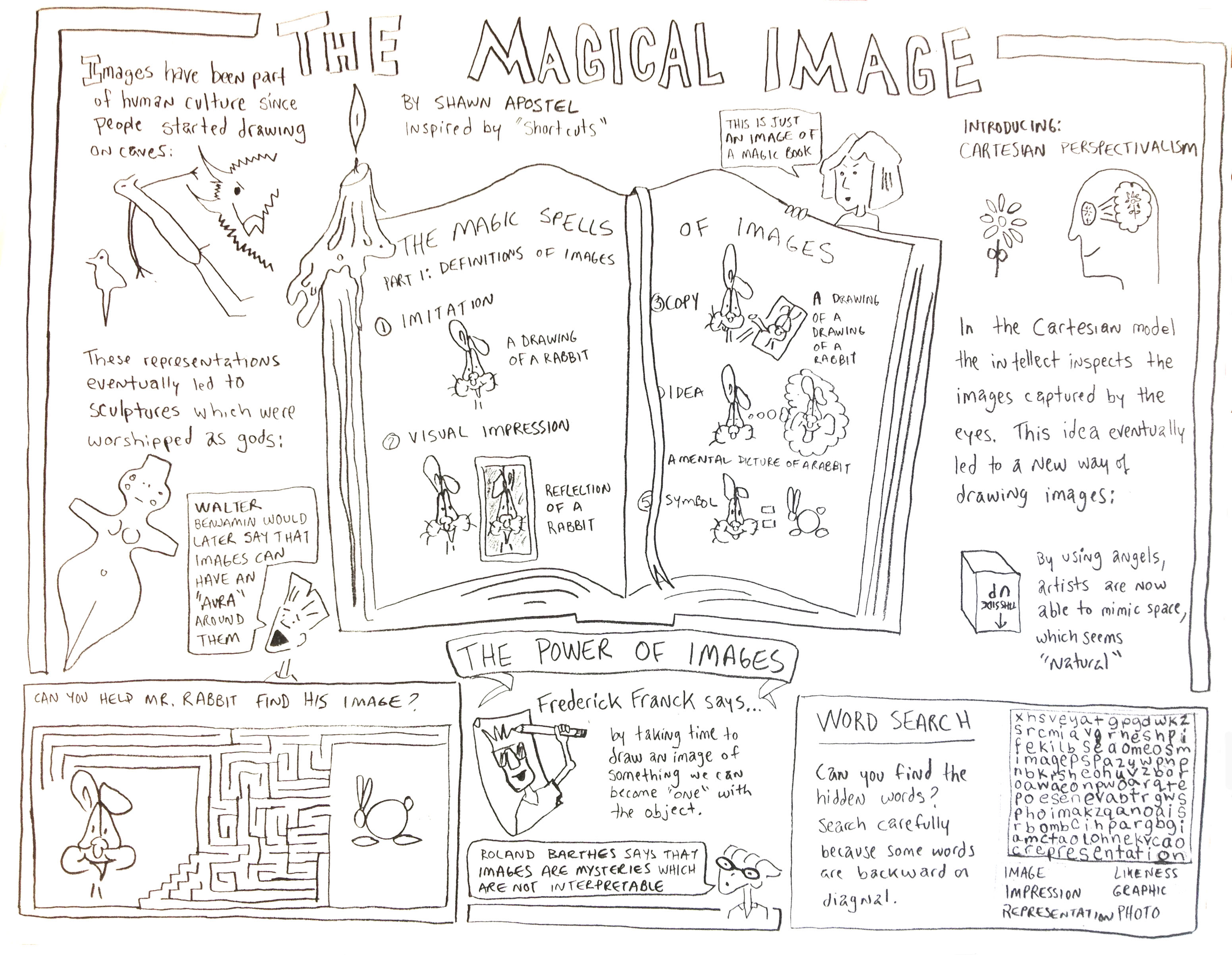
I drew this activity sheet by hand for a minor assignment in class to examine the term "image" in a handout.
It was a minor assignment, and I was happy with the results. Then came the twist. After we submitted our handout, we were asked to remediate our work in the form of a PowerPoint.
Now, I was very comfortable designing PowerPoints when I arrived at Clemson. I designed them for city officials in the job I held at the time, and these presentations were dense, informative, and dull. I remember thinking, “How can I capture the energy and visual nature of my handout with a PowerPoint?” I had never thought of using that program to teach visual communication principles. The assignment forever changed the way I designed PowerPoints. (In case you are interested, I’ve since saved the file and recently uploaded it to YouTube (or see below).
Remember, this PowerPoint was created in 2003. Go easy. I do much better work now. Promise.
From that time on, my PowerPoints were much more visually engaging. I approached each new project with a determination to push the limits of what the program was designed to do, but I was frustrated by the slide show format. I wanted to move around on a slide and explore objects that were off the page (similar to how I worked on projects in programs like Adobe Illustrator and Flash), and I increasingly crashed PowerPoints as I made my presentations more complex. But then came Prezi.
About three years ago I began playing with this free, cloud-based application, and it’s now what I gravitate towards. I enjoy the visual excitement I can create by zooming here and there, and I am finally able to move the screen in ways I'd wanted to do with PowerPoint but couldn't. But as I began to critically analyze my Prezis and others, I realized that, like PowerPoints, Prezis are hard to design effectively. Sure Prezi templates can help, but who likes templates? Not me. I don’t want my visual presentation aid to look like the one used by the speaker I’m following.
So I decided to re-assign myself the project that Yancey gave me 10 years ago using a book that was out at the time. Bruce Block’s (2001) The Visual Story: Seeing the Structure of Film, TV, and New Media breaks pictures into components: space, line, shape, tone, color, movement, and rhythm, which are all part of what makes an effective Prezi. During my tenure at the Noel Studio for Academic Creativity at Eastern Kentucky University, I quickly designed a simple Prezi to familiarize our consultants with these components, and over the years this Prezi continued to evolve into the one featured below.
My goal for this final iteration is to create a Prezi that does what a book cannot:
- teach how a moving visual presentation aid can be designed;
- show the movement that Block was talking about, and not just have viewers imagine the movement in their heads;
- pull the essence of Block’s components and mix them with some concepts that I’ve found useful in visual studies;
- and engage my primary audience, the Multimedia Communication students at Bellarmine University, as well as educators and instructors who would like to use this tutorial in their classrooms.
So please sit back, relax, and enjoy clicking. I hope Yancey approves. She started it.
References
Block, Bruce. (2001). The visual story: Seeing the structure of film, TV, and new media. New York: Focal Press.
Harris, Jeff. (2006). Shortcuts. Retrieved June 30, 2013, from http://www.shortcutscomic.com/
Shawn Apostel, Ph.D.
Bellarmine University
sapostel@bellarmine.edu
@apostels